For many power computer users, moving on to the latest and greatest OS platform is a way of life. They want to be on the cutting edge and own it. While for others, they are more inclined to wait it out to see how the dust settles and bugs are worked out. To date, Windows had its share of buggy releases (remember Vista?) so waiting it out is not a bad option. Also, upgrading to a new operating system can be a real challenge, especially when you have compatibility issues with software and hardware support. Like many, I’ve spent many late hours trying to configure the right software driver for a printer that has not caught up with the latest release.
Mac or Windows:
That is a loaded question, as there is much to consider and a lot hinges on your needs and your comfort level with either platform. With both releases, it is clear they have fully embraced the mobile age as there is definitely tighter integration with mobile operating systems, enabling users to freely toggle between their desktop or mobile phone with better synergy. For some users, the merging of desktop and mobile may not be a desirable feature, especially for those who long for the old days of desktop computers. On the flip side, it may be a refreshing change in the right direction.
Here’s the quick breakdown:
Mac / Mountain Lion:
Upon your initial log in, Mountain Lion looks like your typical OS X desktop–from the menu bar at the top, the familiar OS X Dock at the bottom and the space-themed desktop background. Access to the Finder is relatively easy by clicking the Finder icon (the blue smiling icon), located in the dock. From there, you can view your folder and files-another familiar site for Mac users.
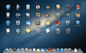
One distinction of Mountain Lion is the Launchpad as you have an iPad-esque grid of icons for your programs, making it easy to access them.
Windows 8:
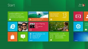
In both operating systems, there are distinct differences to the look and feel and it is evident from the moment you log in. For Windows 8, the look of the familiar start menu, taskbar and Windows Explorer have been replaced by square and rectangular icons for your applications, known as Live Tiles. This experience takes a while to get used to as you have to scroll left and right to view your apps.There is much control over the display of your apps in the start screen, and you have the option to pin other content including internet favorites, bookmarks and custom widgets.
One of the biggest challenges with Windows 8 is the tile interface was really tailored for touchscreen tablets and was not made for a keyboard and mouse. I found myself wanting to go back to just my desktop as that was familiar territory with a better user experience.
So, my vote is for Mountain Lion as it’s more intuitive and just easier to use. Share your thoughts and let me know your experience with either platform.


Recent Comments